Start Forecast Pro and open the project, Tutorial – Accuracy. This project contains forecasts for the cakes and muffins data that we worked with in previous lessons.

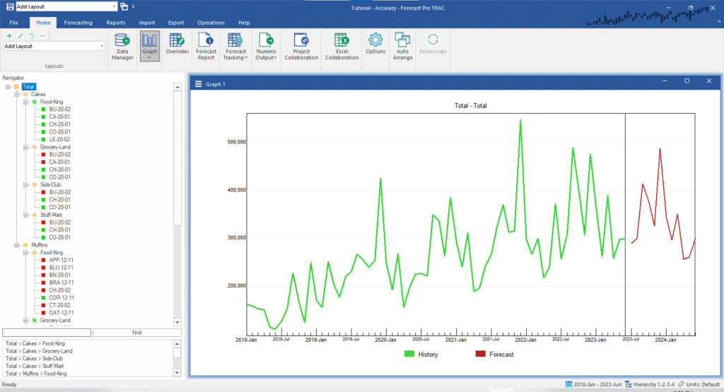
Notice that for the current forecast period, the historic data begins in January 2018 and ends in June 2023 and that the first forecast period is July 2023. Forecast Pro refers to the most recent historic data period used to generate a forecast as the forecast origin. For the current forecast, the forecast origin is June 2023.
In addition to the current period’s forecast, this project contains archived forecasts for the last 12 months.
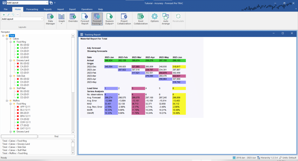
From the Home tab, turn off the Graph view and click on the Forecast Tracking icon to open the Tracking Report. Click the Auto Arrange icon to maximize the Tracking Report view. Your display should now look like the one below.

Due to its cascading appearance, the tracking report is sometimes referred to as a waterfall report. The report compares what we forecasted to what happened, therefore it is based on two key elements—the actual demand history and archived forecasts for the periods being analyzed.
The actual demand history for the most current six months is shown in the first row with the green shading. The next 6 rows display the forecasts generated for these periods from different forecast origins. Thus, the row labeled 2022-Dec displays the forecasts generated six months ago when the forecast origin was December 2022 and the first forecast period was January 2023. The row labeled 2023-May displays the forecast generated last month when the forecast origin was May 2023 and the first forecast period was June 2023.
The waterfall report allows you to highlight different lead times. A lead time refers to the number of periods ahead of the forecast origin the forecast was made for. Thus, a one-month-ahead forecast would have lead time equals 1, a two-month-ahead forecast would have lead time equals 2, etc.
The bottom portion of the report displays cumulative statistics for different lead times.
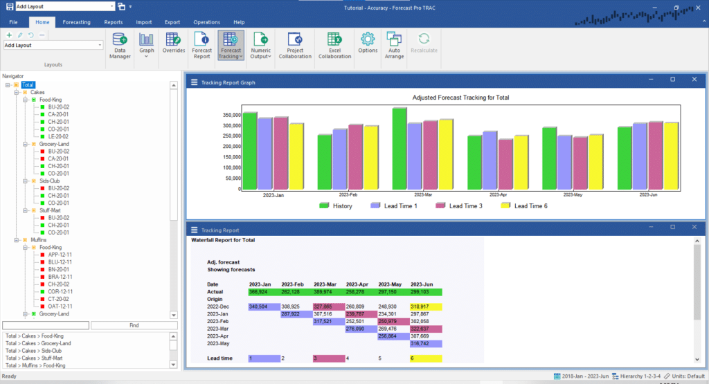
Notice that the forecasts for lead time equals 1 are all shaded in blue, the forecasts for lead time equals 3 are all shaded in maroon and the forecasts for lead time equals 6 are all shaded in yellow. Open the drop-down on the Forecast Tracking icon and select Graph. This will open Tracking Report Graph view. Tile the open views by clicking the Auto Arrange icon.

Notice that the Tracking Report Graph uses the same color coding as the Tracking Report. You can control the lead times to color code using the Tracking Report Settings dialog box.

