Forecast Pro TRAC only
The Tracking Report and its associated Tracking Report Graph view allow you to compare previously generated forecasts with what actually happened. To view the Tracking Report, your Forecast Pro database must contain archived forecasts.
To open the Tracking Report, click the Forecast Tracking icon on the Home tab or the Reports tab.

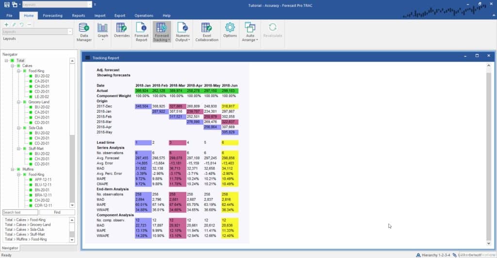
Due to its cascading-like appearance, the tracking report is sometimes referred to as a waterfall report. The report compares what we forecasted to what actually happened. Therefore, it is based on two key elements—the actual demand history and archived forecasts for the periods being analyzed.
In the example above, the actual demand history for the most current six months is shown in the first row with the green shading.
The next row down, Component Weight, displays the percentage that the demand represents of its parent group. In our example, in January 2020 Total>Cakes>Food-King composed 38.81 percent of the demand for its parent group, Total> Cakes. This row is only displayed if Include component weights is selected in the Layout section of the Tracking Report Settings, as described shortly.
The next 6 rows display the forecasts generated for these periods from different forecast origins. The row labeled 2019-Dec displays the forecast when the forecast origin was December 2019, and the first forecast period was January 2020. The row labeled 2020-May displays the forecast generated the prior month when the forecast origin was May 2020, and the first forecast period was June 2020.
The waterfall report allows you to color code lead times. A lead time refers to the number of periods ahead of the forecast origin the forecast was made for. Thus, a one-month-ahead forecast would have lead time equals 1, a two-month-ahead forecast would have lead time equals 2, etc.
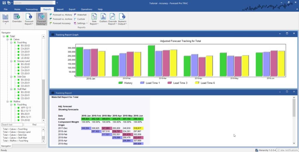
In our example, the forecasts for lead time equals 1 are all shaded in blue, the forecasts for lead time equals 3 are all shaded in magenta, the forecasts for lead time equals 6 are all shaded in yellow. The color coding is used on both the tracking report and the tracking report graph. You can control the lead times to color code using the Tracking Report Settings dialog box.
The bottom portion of the report displays cumulative statistics for different lead times.
The cumulative statistics for different lead times portion of the report can include up to three sections—Series Analysis, End-item Analysis and Component Analysis. End-item Analysis and Component Analysis are only relevant to group-level data and are not displayed if an end-item is selected. By default, only Series Analysis is shown. Use the Tracking Report settings to turn on End-item and/or Component Analysis.
Series Analysis displays statistics for the currently selected time series. If the selection is a group, the statistics are based on the archived group-level forecasts. The CMAPE statistic found in this section is the Component MAPE. This is a weighted MAPE where the weighting factors are the component weights (see discussion above).
End-item Analysis displays statistics based on the archived forecasts for all end-items belonging to the currently selected group. The WMAPE statistic found in this section is a weighted MAPE where the weighting factors reflect the end item’s volume. The weights are calculated by dividing each end item’s volume by the group’s volume.
Component Analysis displays statistics based on the archived forecasts for all component children (i.e., groups and/or end items one level lower in the hierarchy that are components of the currently selected group). The WMAPE statistic found in this section is a weighted MAPE where the weighting factors reflect the component children’s volume. The weights are calculated by dividing each component child’s volume by the group’s volume.
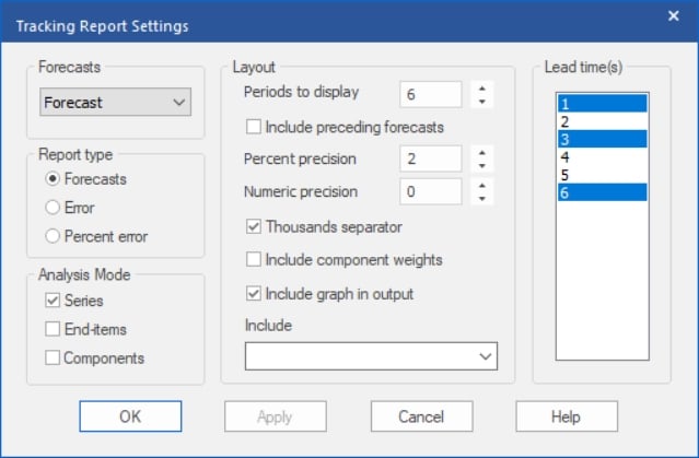
The content and format of the Tracking Report is controlled using the Tracking Report Settings dialog box. This dialog box is invoked by selecting Settings on the Forecast Tracking icon drop-down on the Home tab or Report tab, by selecting Tracking Report Settingsfrom the Tracking Report view’s context menu or by selecting Settings on the view’s hamburger menu.

The Forecasts dropdown allows you to display either the statistical or adjusted forecasts.
The Report type section allows you to display the forecasts, the forecast error or the percent forecast error.
The Analysis Mode section allows you to specify which cumulative lead time statistic displays to include.
Most of the items in the Layout section are self-explanatory, however, we will comment on a couple of them. “Periods to display” controls the number of lead times to include in the report. The “Include preceding forecasts” option displays all archived forecasts that go into the cumulative statistics rather than just the subset in the triangular display.
The Lead time(s) box allows you to specify up to four lead times to color code. The selected lead times are used on both the numeric and graphical displays.
You can open the Tracking Report Graph by selecting Graph on the Forecast Tracking icon drop-down on the Home tab or Reports tab.

For each historic period, the graph displays the actual historic value and the archived forecasts for the lead times selected in the Tracking Report Settings dialog box.

