The graph views are used to display variables and forecasts graphically. You can include up to five graph views. In addition to providing a convenient way to view the forecasts while using Forecast Pro, a graph can also be included in the formatted forecast reports that you save to Excel. The format and content of the formatted forecast report’s graph will match the current settings for the Graph 1 view.
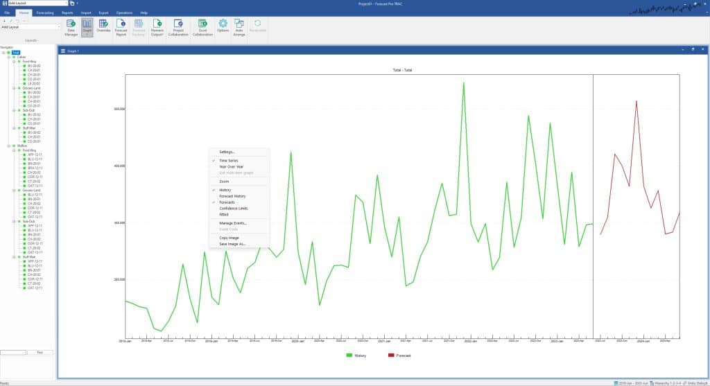
The Graph Settings dialog box allows you to customize the Graph view. This dialog box is invoked by selecting Settings on the view window’s hamburger menu or by selecting Settings from the Graph view’s context menu.
The Settings dialog box contains three pages or tabs. We will discuss each in turn.
Layout Tab
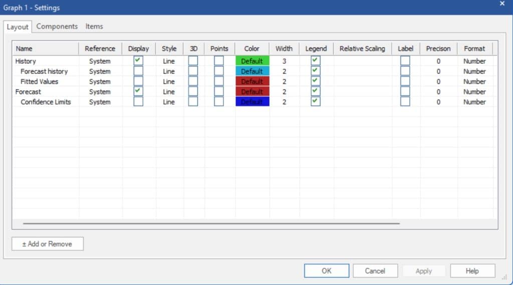
The Layout tab allows you to the select which components to display and format those components as you choose. The History, Fitted Values, Forecast and Confidence Limits components are always available in the Layout tab, and you can use the display checkboxes to hide/unhide them from the Graph view. You can also use the context menu/hamburger menu to choose what is being displayed in the Graph view. When you first start a project, the default graph displays the History and Forecast components. The Forecast History line will automatically appear when you define your first Forecast History (see the Working with Product Mapping and Mapped History section for more details).
Other graph components may be added to or removed from the Layout tab using the Add or Remove button. Clicking the Add or Remove button brings up the Add or Remove dialog box shown below. The checkboxes are used to select which components should be included in the Layout tab. The Filter drop-down is useful for selecting components by variable type.
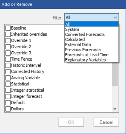
Clicking OK exits the Add or Remove dialog box and updates the list of components in the Layout tab.
You can set specific formatting options for each component.
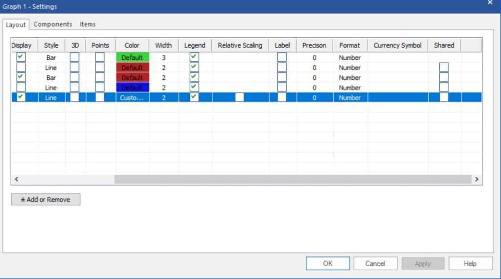
Most of these options are self-explanatory. The Style drop-down provides four options: Scatter, Line, Bar or Area. Relative Scaling is only available for Converted Forecasts, Calculated Rows, External Data and item specific Explanatory Variables. Selecting Relative Scaling will display that component on its own scale. This is useful when graphing multiple components with dramatically different values. The Shared option allows you to coordinate color and numeric displays with the Override view. Checking Shared applies your Graph Setting selections to the Override grid, providing synchronized views.
Components Tab
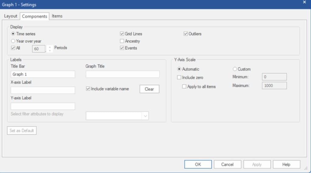
The Components tab includes three sections.
The Display Section
The Display section allows you to select the graph type.
Time series displays a graph that includes both the historic and forecast periods. The All option will display the entire data set in a non-scrollable display. If the All option is not selected, the Periods option allows you to set how many periods should be included in a scrollable display.
Year over year displays a graph where the x-axis is one year long and the data for each year are “stacked” on the display. The Years option allows you to specify the number of years to include in the display.
The Grid Lines option displays grid lines on the graph. The Ancestry option displays the complete ancestry in the variable name (the variable name will appear preceded by any applicable parent group names). The Events option marks all historic or forecast points where an event code is being applied. The Outliers option marks all historic points where an outlier was detected and/or corrected.
Selecting Zoom on the Graph context menu or hamburger will activate the scrollable display. You can also switch between displaying the Graph view as a Time Series or as Year over Year using the context menu and hamburger menu.
The Labels Section
The Labels section allows you to define labels for the X and Y axis and add titles to the window and graph. The Graph Title appears within the Graph view, and the Title Bar label allows you to rename Graph 1 to a custom name. Include variable name will use the variable name followed by the description as the graph’s subtitle. The Clear button erases the current labels within the Graph view (the Title Bar name will remain).
The Y-Axis Scale section controls the scaling for the selected item. Please note that these are item-level settings.
Automatic allows Forecast Pro to select the Y-axis scale.
Custom lets you set the minimum and maximum for the Y-axis scale.
Include zero begins the y-axis at zero or at the minimum negative value. If you select Apply to all items, the Include zero option will be applied globally to all items.
The Labels and Y-axis Scale settings are shared by the Year over Year and Time Series graphs. If you prefer to use different settings for the different graph types, using multiple graph views or layouts is a good way to do so.
Items Tab
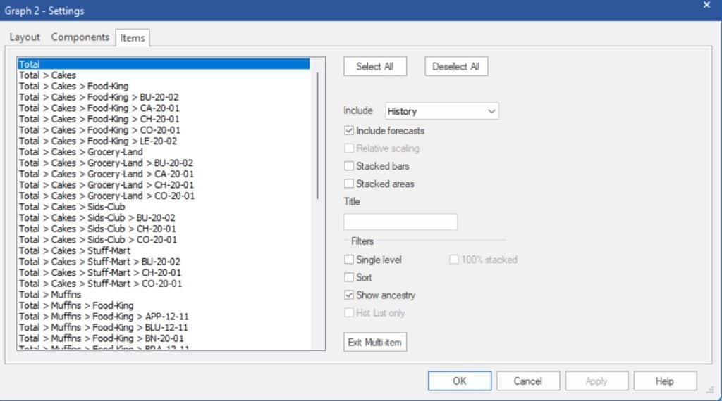
The Items tab allows you to graph multiple items and/or helper variables on a single graph. Simply select the items you want to display and then click the OK or Apply button.
The Include history drop-down allows you to select if you want to display History, Forecast History or neither.
The Include forecasts option indicates if the graph should include the forecasts.
Relative scaling indicates if each graphed item should be displayed on its own scale.
The Stacked bars and Stacked area options are useful if you want to understand the contribution of the graphed items to a total. If you use a stacked option, the height of the graph for a given period is sum of the graphed items.
You may enter a title for the graph in the Title text field.
The Filter options can be used to limit which items are displayed for selection, to sort the items or to specify if ancestry should be included for items displayed for selection.
The Exit Multi–item button returns the graph view back to the default, single item settings.

