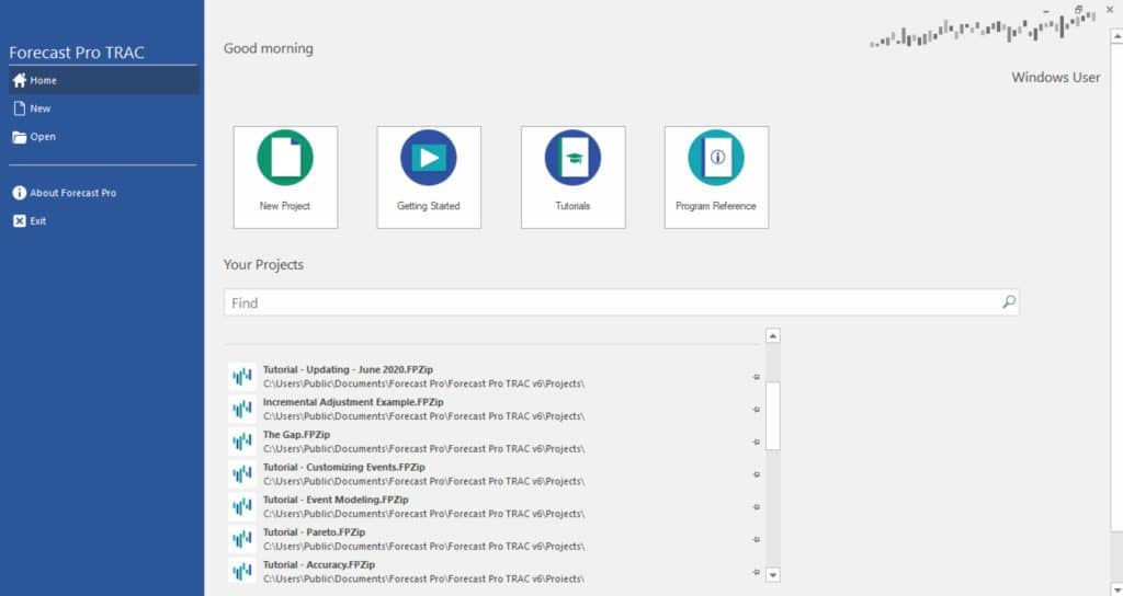
When you open Forecast Pro, the program will display a startup page like the one below.

The startup page allows you to open an existing project, start a new project, view a Getting Started video, open the Tutorials manual or open the Program Reference manual. Once you start a new project or open an existing project, the main Forecast Pro interface appears.
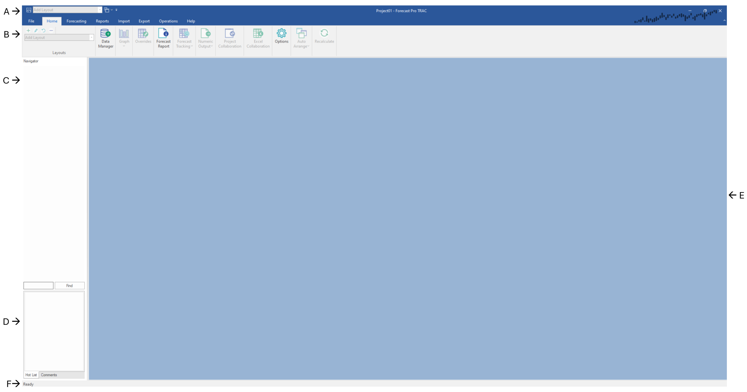
The Forecast Pro interface consists of a Quick Access Toolbar (A), a ribbon menu (B), a Navigator (C, currently unavailable), a Hot List & Comments section (D), a view window (E) and a status bar (F).

(F) Status Bar
Quick Access Toolbar
Located in the upper left-hand corner of the display, the Quick Access Toolbar contains frequently used icons. The Quick Access Toolbar initially contains the Save and Auto Arrange icons as well as a Layout selection drop-down and a Customize drop-down. The Customize drop-down allows you to specify the icons you wish to display in the Quick Access Toolbar.
Ribbon Menu
The ribbon menu provides access to almost all Forecast Pro functionality. The functionality is organized into seven ribbon tabs: File, Home, Forecasting, Reports, Import, Export, Operations and Help. Clicking on one of these tabs will display the ribbon for the selected tab. Each ribbon is a collection of icons and drop-downs, often organized into groups. The most commonly used procedures are available on the Home tab (selected above). The seven tabs are described in Forecast Pro Ribbon Tabs chapter.
The Navigator
The Navigator is the primary way to select an item to view in the Forecast Report, Graph, Override, Forecast Value Add and Tracking Report windows. It is also how you select the item you want to customize using the Forecasting tab. After the data has been read, the Navigator displays the available time series in a tree structure. The tree structure is defined by the hierarchy in your historic data files. Selecting an item on the Navigator will automatically display all relevant information in the open views.
The Navigator also features color-coded icons to allow you to spot items that contain overrides and/or comments. A red icon indicates that the item contains an override and/or comment. A green icon indicates that the item does not contain an override or comment. A yellow icon on a group indicates that at least one item further down that branch of the tree contains an override and/or comment. A light blue icon (applicable only if either Manual forecast or Manual override mode is selected on the Performance tab of the Options dialog box) indicates that an item’s forecast needs to be updated with the Recalculate icon on the Home tab. A dark blue icon (applicable only if Manual override mode is selected on the Performance tab of the Options dialog box) indicates that an item’s override calculations need to be updated with the Recalculate icon on the Home tab.
If you are using mapped history, your forecast history may be different than your actual history. See Working with Product Mapping and Mapped History for details. If mapped history exists for an item, the icon shape will be a plus instead of a square. The same color conventions discussed above still apply.
If you are using Project Collaboration, a lock icon is used to indicate that a group item cannot be edited in the child project. If a group is locked, you are unable to adjust that group’s forecasts via modifiers or overrides. A group is locked when the child project only contains a subset of the group’s end items in the parent project.
The Navigator context menu provides extensive functionality for working with your data and the Hot List. Please see The Navigator Context Menu for details.
The Hot List & Comments
The Hot List & Comments section is located in the bottom left-hand corner of the screen, below the Navigator. Notice that you can switch between Comments and Hot List using the tabs at the bottom of the screen.
In addition to making comments associated with an override cell, you can also make a comment associated with the current selection on the Navigator. Comments help document your forecasting process by providing useful notes in a collaborative thread. The comment thread for the selected item are visible in the Comments area below the navigator. If you want to see all the comments in the project you can open the Comments Report on the Reports tab (see more details on this report here).
Placing items on the Hot List allows you to efficiently navigate, work with and report on a subset of the items listed on the Navigator. Items can be added to the current Hot List by dragging from the Navigator or by using the Add to Hot List option on the Navigator’s context menu. A Hot List can also be defined based on the items currently displayed in a report. You may use filters in a report to get the desired subset of items, then use the report’s context menu or hamburger menu to add all the items currently displayed in the report to the Hot list.
When you select an item on the Hot List, Forecast Pro will immediately select the item on the Navigator and update the affected views.
Right click in the Hot List area to open the Hot List’s context menu. The Hot List’s context menu allows you to sort the Hot List alphabetically, change how items are displayed and remove items from the current Hot List. The Open Hot List option allows you to open a Hot List which had been saved to Excel or import a Hot List from another project. The Save Hot List option allows you to export the current Hot List to Excel. The ability to import and export Hot Lists to Excel allows you to create multiple Hot Lists for a project and switch between them.
Please consult the Advanced Navigation tutorial for more details.
View Window
Forecast Pro allows you to open multiple views in the View Window. These views may be resized, maximized or minimized and arranged as you wish using standard Windows functionality. Left click on the border of an open window and drag the mouse to resize and left click on a window’s title bar and drag the mouse to move the window.
You may also tile the open views using Auto Arrange icon on the Home tab and Quick Access Toolbar. This can be helpful when you open a new view. The drop-down on the Auto-Arrange icon allows you to tile windows vertically instead.
Please consult Forecast Pro Views for more details on Forecast Pro view functionality.
The Status Bar
The Status Bar, on the bottom of the Forecast Pro window, displays key information about the status of the open project.
On the right-hand side you will see the beginning and ending periods for your historic data, the current hierarchy, and the current unit definition for your project. As described in The Navigator Context Menu, Forecast Pro allows you to group your data in different ways by “shuffling” the hierarchy. The current hierarchy ordering is shown next to the Hierarchy icon on the status bar. Forecast Pro also allows you to convert your default units (how the historic data is defined) into alternative measurements, such as dollars, using a Conversions data file (see Conversion factors in Setting Up You Optional Data). You may change your unit measurement to one of the read-in conversion factors on the Operations tab. The status bar displays the unit measurement that is selected in the Units drop-down on the Operations tab.
Changing the display units and/or altering the hierarchy will “lock” the statistical forecasts. When the statistical forecasts are locked, you are no longer able to change the statistical forecasting methods used to generate the statistical forecasts and the sections of the Forecast Report that pertain to the statistical modeling (i.e., Expert Analysis, Model Details, Within-Sample Statistics, Out-of-Sample Tests and Outliers) are omitted. If you subsequently return to the default state (i.e., default units and default hierarchy) the statistical forecasts will be “unlocked.” If you are in a locked state, Forecast Pro displays a lock icon with the text “Stat Forecast Locked” on the far right of the status bar.
The left-hand side of the status bar displays dynamic information about the current project status. When using the override grid, the status bar will display the total and average for selected override grid cells. These are also displayed if you select numeric values in one of the report views.

