We will now add a calculated row to show the difference between our current Forecast Pro forecast and the Management Forecast.
Highlight the Management Forecast row, right click to invoke the context menu and select Add Row. A small dialog appears to allow you to name the row and to select whether it is a global or item-specific calculated row. Select Global and name the row “The GAP.”
The GAP is a calculated row. You can enter formulas into the cells of calculated rows, and they will be used for all items on the Navigator. Select the first cell in The GAP row (July) and enter the formula:
=forecast – {management forecast}
Alternatively, you could have built the calculation using mouse-selected cell references, similar to how you would in Excel. Let’s try this for the August cell. Select the second cell in The GAP row (August) and enter “=” in the selected cell, then click on the forecast cell for August, then enter “-” and then select the Management Forecast cell for August and finally press Enter to complete the formula. This generates a similar formula (=HISTFC-{MANAGEMENT FORECAST}) to what we entered for July.
Formulas are not case sensitive. You must use the curly brackets when referencing an external row or a calculated row. “Forecast” is a system row, so the name is a token (i.e., pre-defined term) and does not require brackets. System rows are defined within Forecast Pro and are consistently named across projects. “HISTFC” is another commonly-used token that is equal to the forecast if used in a forecast period and is equal to the historic demand if used in a historic period. A complete listing of supported operations and tokens can be found in Defining Calculated Rows.
Use the copy and paste commands to copy the formula into the other cells in The GAP row. Click the Commit button to confirm the changes.
Let’s add another row to display The GAP as a percentage. Highlight the The GAP row, right click to invoke the context menu and select Add Row. Name this row “Percent GAP.”
Select the first cell in the Percent GAP row (July) and enter the formula:
= {the gap} / forecast
Notice that the value is being rounded to zero. We will reformat the row to display as a percentage in a moment. Use the copy and paste commands to copy the formula into the other cells in the Percent GAP row. Click the Commit button to confirm the changes.
Right click on the override grid to invoke the context menu and select Settings.
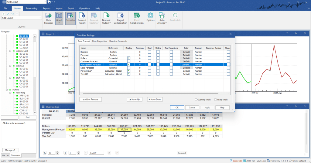
On the Management Forecast row in the dialog box, select Custom on the Color drop-down and set the background color to yellow in the Color dialog box. Click the Apply button to update the display without leaving the settings box.

Select the Percent GAP row, set the Format to Percent and check Red Negatives. Click the Move Down button to swap the position of the calculated rows. Select the GAP row, check Bold, check Red Negatives. Click the Apply button to update the display without leaving the settings box.
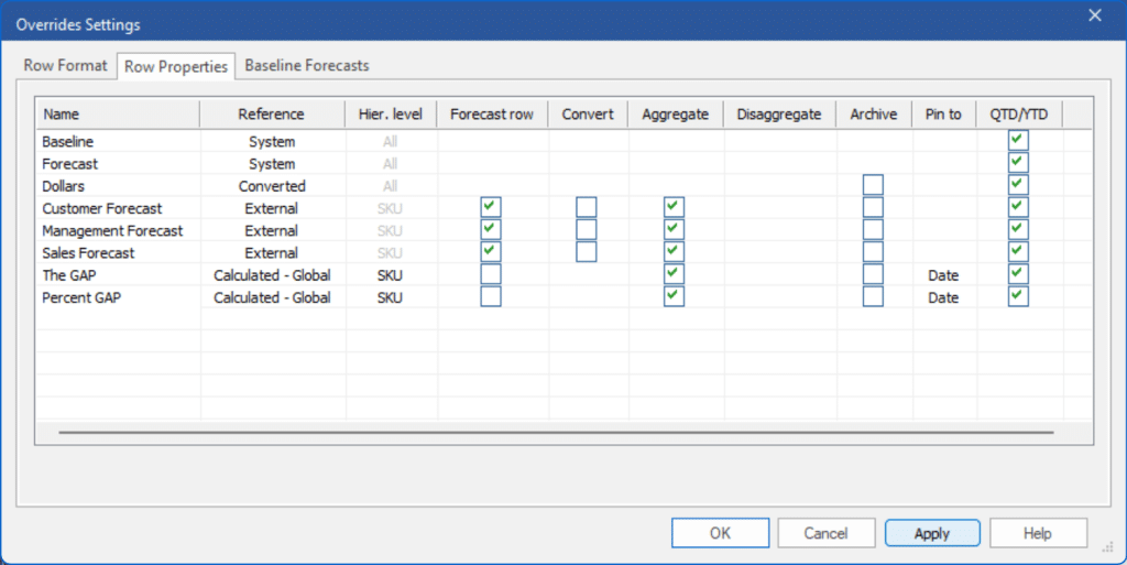
Select the Row Properties tab.

This tab allows you to control how rows are calculated, whether or not they appear at different levels of the hierarchy and how they are stored in the Forecast Pro database.
When defining a calculated row, you can either (1) perform the calculations at a single level of the hierarchy and then (optionally) display aggregated and/or disaggregated values at other levels, or (2) calculate the values at all levels. Depending on the formulas you define, these two approaches can result in very different values being displayed.
In our current example we have two calculated rows, The Gap and Percent Gap. Both are currently set to calculate the values at the lowest level (i.e., SKU) and display aggregated values at higher levels. The Gap is simply the difference between two forecast rows and both approaches will yield the same results. The Percent Gap formula defines a percentage and aggregating percentages is very different from calculating them at all levels.
Change the Hier. Level setting for Percent Gap to All so that the formula is calculated for all hierarchy levels. Click OK to update the display and exit the dialog box.
The last change that we will make to the worksheet is to insert a blank row between the Dollars row and the Management Forecast row to make the display a bit easier to read. Highlight any of the rows underneath the override section of the grid to invoke the context menu and select Add Row. Delete the default row name “Calculated 3” so that the box is empty and click OK. Open the Overrides Settings again and use the Move Up/Move Down buttons to position this blank row between the Dollars and Management Forecast.
Let’s now modify the graph to display a bar graph showing the Forecast and the Management Forecast.
Right click on the graph to invoke its context menu and select Settings. On the Layout tab, turn off the historic values by unchecking the History row’s Display checkbox. Click the Add or Remove button to open the Add or Remove dialog box. Select Management Forecast and click OK. Make sure that the Management Forecast row’s Display checkbox on the Layout tab is checked. Click the Apply button to update the display without leaving the settings box.
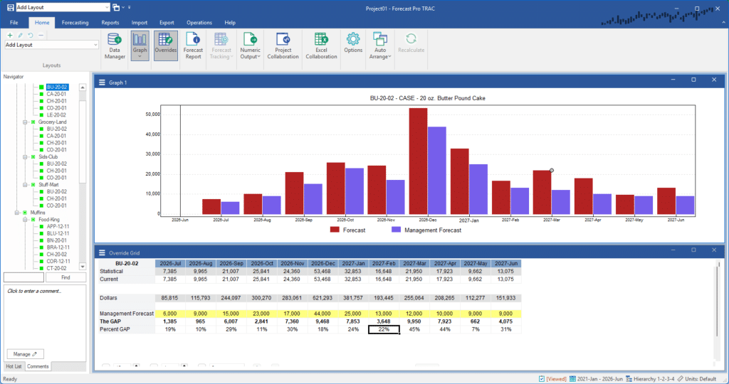
Let’s create a bar graph. On the Layout tab, use the Forecast row’s Style drop-down to change the style from Line to Bar. Now change the Management Forecast row’s style to Bar as well. Click OK to update the display and exit the dialog box. Your display should look like the one shown below.

Exit the program. This concludes the Customizing the Override Grid tutorial.

