Start the program, select New Project and click the Data Manager icon on the Home tab to call up the Data Manager. Click the Add drop-down on the Historic Data row, select Excel and select Electricity – Historic Data.xlsx to add it to the Historic Data row. Click the Add drop-down on the Explanatory Variables row, select Excel and select Electricity – Explanatory Variables.xlsx to add it to the Explanatory Variables row.
Click the Read & Forecast button to read in the historic demand data and generate the statistical forecasts.
Click the Exit button to exit the Data Manager.
Right click on the Navigator to invoke its’ context menu and select Expand All to fully expand the Navigator. Turn off the Override view by clicking the Overrides icon and click Auto Arrange to maximize the Graph view. Your display should now match the one shown below.
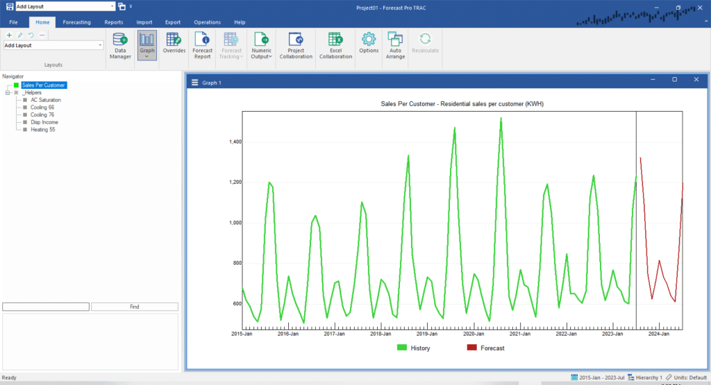
The data series for this lesson consist of:
- Sales per Customer: Residential electricity sales (KWH) per customer.
- AC Saturation: Air conditioning saturation rate.
- Cooling 66: Cooling degree days at base temperature 66 degrees.
- Cooling 76: Cooling degree days at base temperature 76 degrees.
- Disp Income: Disposable income per household.
- Heating 55: Heating degree days at base temperature 55 degrees.
Sales per Customer is the dependent variable (the one we will be forecasting). The remaining variables are explanatory variables (also called independent variables). Cooling 66 and Cooling 76 are measures of summer heat and Heating 55 is a measure of winter cold.
Our first step is to examine the dependent variable graphically. Notice the strong seasonal patterns in the data and the varying heights of the summer and winter peaks. Much of the variation is due to air-conditioning and heating, which is primarily driven by the temperature. We will try to capture this relationship by using the weather variables.
Right click on the graph to invoke the graph’s context menu and select Settings to invoke the Settings dialog box. Select the Items tab. This tab displays the variables available on the Navigator and allows you to graph up to five of them together.
Select Sales per Customer and Cooling 66, uncheck the Include forecasts option (this turns off the statistical forecasts for the dependent variable—Sales per Customer in this case) and click OK.
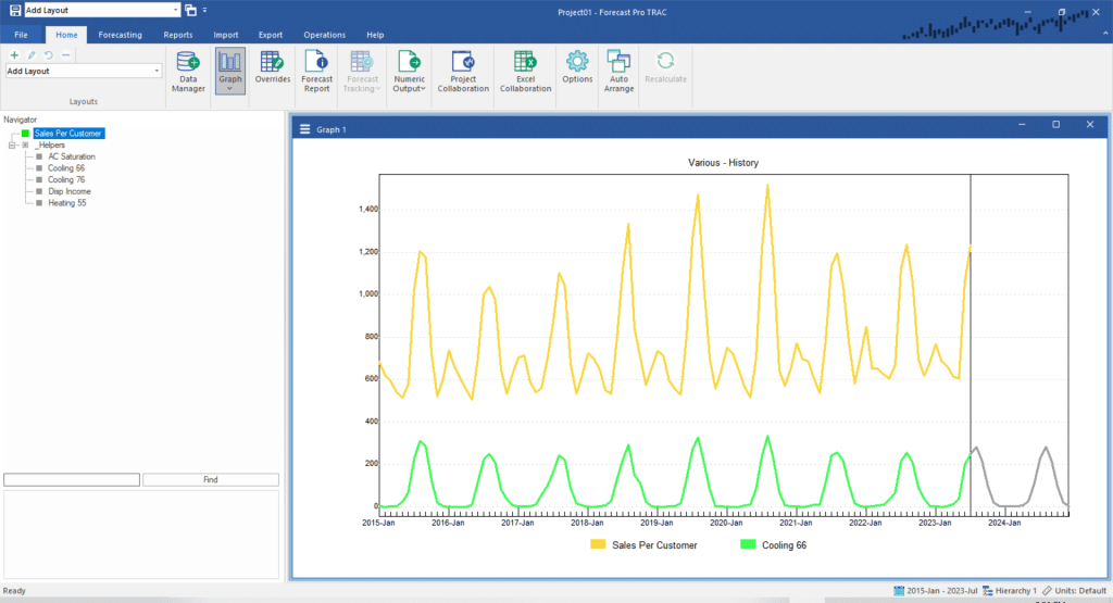
Notice that the peaks in Cooling 66 correspond to the summer peaks in Sales per Customer. This suggests that Cooling 66 is a powerful explanatory variable.
Notice also that forecasts are supplied for Cooling 66. To generate a forecast for your dependent variable your explanatory variables needs to be forecasted. Normally, you will want to supply appropriate forecasts for each explanatory. This will generate forecasts for your dependent variable using the forecast scenarios you’ve provided for the explanatory variables. If you do not supply forecast scenarios for all of your explanatory variables (or if your forecast scenarios do not cover the entire forecast horizon), you can use Forecast Pro’s Auto Extend functionality to generate the required forecasts using expert selection.
Try graphing some of the other variables to see how they relate to the Sales per Customer data. Keep in mind that you can use the Relative scaling option to view variables with very different scales. When you are finished exploring the data, open the hamburger menu in the upper left corner of the graph view and select Exit multi-item graph.
Right click the graph to invoke its context menu and select Fitted to toggle on the fitted values. Open the Forecast Report by clicking the Forecast Report icon on the Home tab, and click the Auto Arrange icon to tile the windows. Your screen should now match the one below.
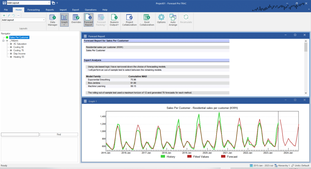
The current forecast was generated using a seasonal exponential smoothing model chosen via expert selection (expert selection does not consider dynamic regression). Notice that the adjusted R-square for this model is 0.89 and that although the model is capturing a seasonal pattern it is not capturing the amplitude of the seasonal peaks very well. These peaks are driven by weather conditions and we will be able to capture them much more effectively using dynamic regression.
Go to the Forecasting tab and click the Dynamic Regression icon. This will invoke the Dynamic Regression dialog box shown below:
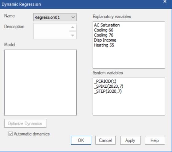
There are two types of variables that can be included in a dynamic regression model—explanatory variables and dynamic terms. Explanatory variables allow you to capture how the dependent variable changes in response to external variables. The Explanatory variables box lists all the variables read in with the Data Manager. The System variables box lists explanatory variables that can be defined in the program as well as dynamic terms. Dynamic terms capture how the dependent variable changes in time and can help forecast trends and seasonal patterns in a similar fashion to extrapolation methods such as Box-Jenkins and exponential smoothing.
Forecast Pro offers an Automatic dynamics mode whereby you specify the explanatory variables to include and the program automatically determines the dynamic terms to include. When you use Automatic dynamics, the dynamic terms are not visible in the Dynamic Regression dialog box. This lesson focuses on building models with Automatic dynamics. Please see here for details on building regression models without Automatic dynamics.
Building a regression model often involves a sequence of rounds. You posit an initial model, diagnose it and either accept it as final or make a change to improve it. Whenever you make a change, you generate a new model to either accept as final or make an additional change. The process continues until you are satisfied with the model.
There are many ways to build a regression model. Some people begin with a model that includes many terms and weed out the terms that aren’t statistically significant. Others begin with a simple model and add variables one by one. We will take the former approach.
We’ll begin by building a model which includes all of our explanatory variables. Double click AC Saturation in the Terms list box and notice that this adds the variable to the current model specification. Double click Cooling 66, Cooling 76, Disp Income, and Heating 55 to add them to the model specification.
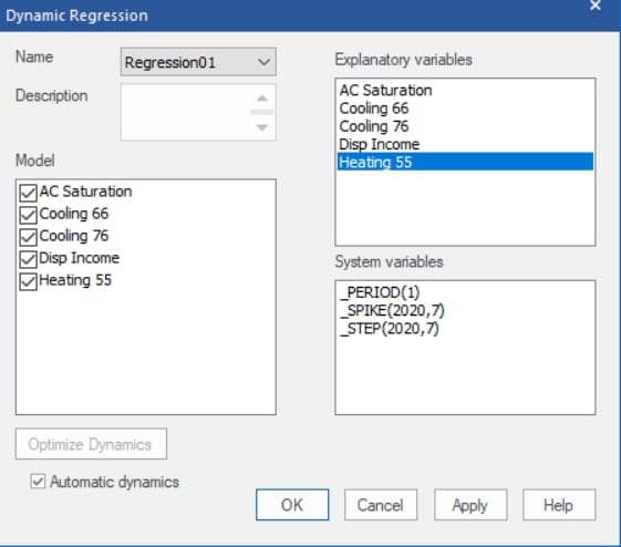
Your Dynamic Regression dialog box should match the one above. Notice that the Automatic dynamics option is selected. Click OK to build the model.
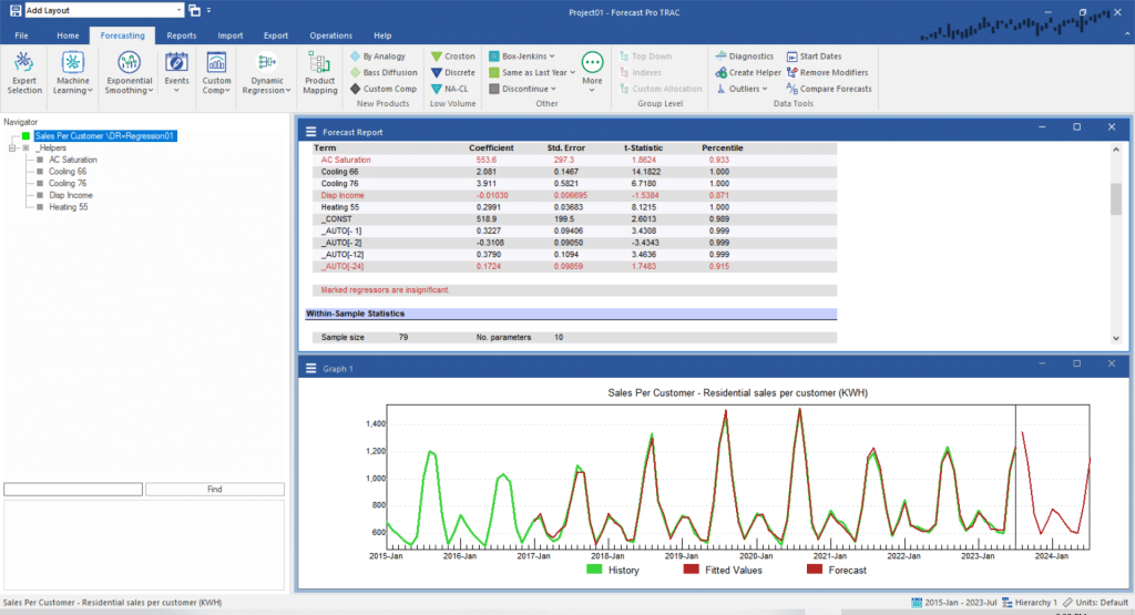
Take a look at the graph. Notice that the regression model fitted values capture the seasonal peaks much better than the seasonal exponential smoothing model.
Scroll the Forecast Report so you can view the Model Details section. Notice that the model includes the five explanatory variables that you specified as well as five dynamic terms. The dynamic terms consist of a constant (_CONST) and four autoregressive error terms (_AUTO). Models that include autoregressive error terms are referred to as Cochrane-Orcutt models. You can learn more about these models in the Forecast Pro Statistical Reference Manual.
Notice that two of our explanatory variables appear in red. This indicates that their T-statistics are not significant and you should consider removing them from the model. A best practice when making a change to a regression model is to make only one change at a time. Let’s begin by removing Disp Income which is the least significant of the flagged variables.
Right click on the Disp Income row on the Forecast Report to invoke the Forecast Report’s context menu. Select Remove ‘Disp Income’ from model. Notice that this builds a new model which does not include Disp Income.
AC Saturation is still marked in Red, indicating that it is not significant. Remove AC Saturation from the model by right clicking on it and selecting Remove ‘AC Saturation’ from model on the context menu. Your screen should now match the one below.
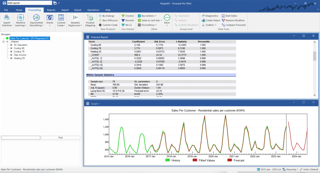
This dynamic regression model is substantially better than the exponential smoothing model selected by expert selection. All terms are significant, the adjusted R-square is 0.99 and the model captures the changing amplitudes of the seasonal peaks.
Exit Forecast Pro.

