Select the Reports tab on the Ribbon menu.
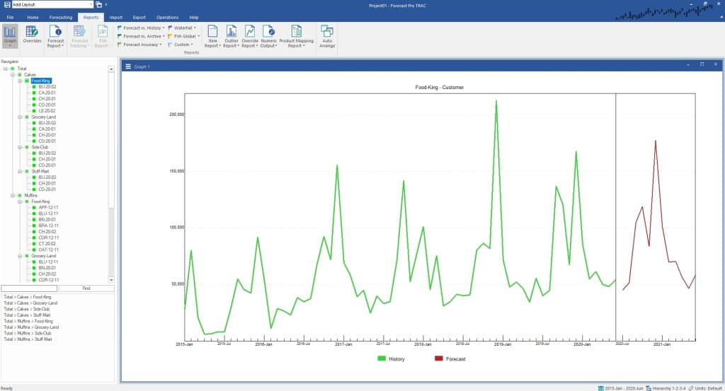
The Graph, Forecast Report and Forecasts Tracking views are item-specific and update as you change the item selected on the Navigator. The remaining reports represent non-context specific (i.e., global) views that may include all forecasted items or a static subset of items (e.g., a hot list). The contents of these views do not depend on what item is selected in the Navigator.
- Exception Reports allow you to monitor performance and identify items with potential issues.
- The Item Report displays model details, model statistics, forecasts and other time series data in a concise display.
- The Outliers Report lists information pertaining to all detected outliers in the current project.
- The Override Report allows you to display all overrides that are present in the current project.
- The Numeric Output Report is very similar to the Item Report, but it is primarily intended to be used for defining output for use with other applications.
- The Comments Report is used to display all comments that have been made by anyone using the project.
- The Mapping Report displays all product mappings in the current project.
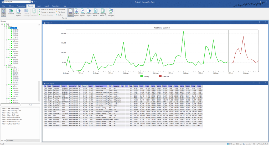
Click on the Graph icon to close the Graph view and then click on the Item Report icon to open the Item Report. Click on the Auto Arrange icon (to the right of the Layouts drop-down) on the Quick Access Toolbar to maximize the Item Report view.
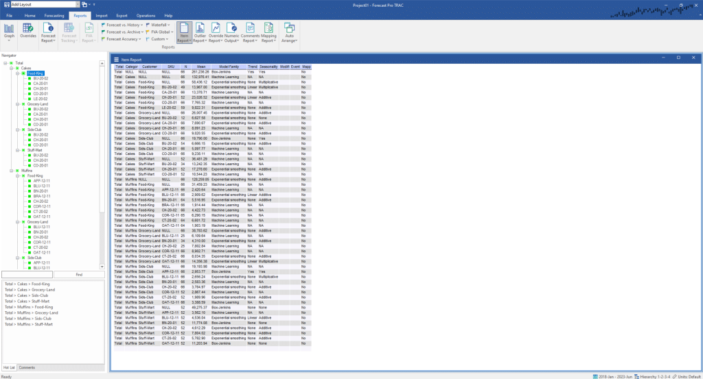
Notice that each row represents an item on the Navigator. By default, the report shows information for each item on the Navigator including data length (N), data scale (Mean) and details regarding how the item was forecasted. Click on the Item Report’s hamburger menu and select Settings.
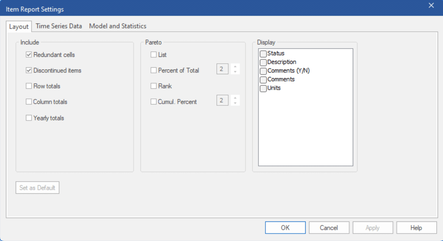
The options in the Item Report Settings dialog box allow you to add and remove columns from the Item Report view. The tabs organize the available options into logical groupings.
The Layout tab allows you to add or remove descriptive fields, filters (if a filters file was read in the Data Manger) and Pareto statistics. It also gives you control over how attribute fields are displayed and whether or not to include rows for items that were not forecasted.
Select the Model and Statistics tab. This tab allows you to add or remove fields pertaining to model descriptions, model statistics and safety stocks. The spinners to the right of each item are used to specify numeric precision. Use the spinner for Historic mean to decrease the numeric precision to 0. Check MAPE, leaving the numeric precision at the default of 2 and click Apply. Notice that the report has been updated to include the additional column and defined precision.
Select the Time Series Data tab. This tab allows you to add or remove various time series, such as the forecasts, external data, etc. Select Forecasts, select Upper limits and click the Apply button to update the Item Report view.
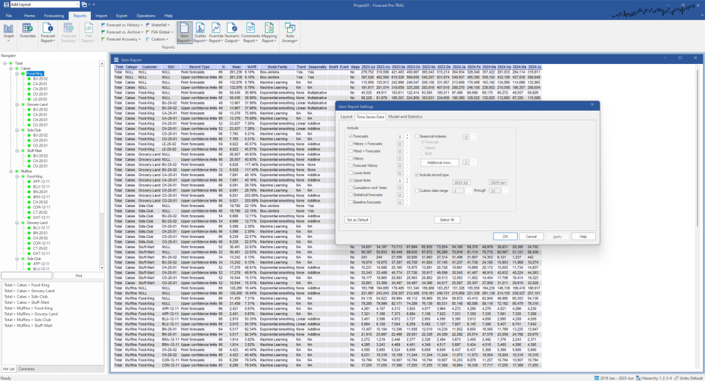
Notice that there are now two rows for each item, the first displaying the forecasts and the second displaying the upper confidence limits. For this example, we do not want to include the upper confidence limits, so remove the checkmark for Upper limits and click OK to exit the dialog box and update the Item Report view.
Now let’s explore changing the items included in the Item Report. Right click on the Item Report to invoke its’ context menu. Alternatively, you may open the hamburger menu on the top left of the Item Report window. Hover over Display and notice that All Items is currently selected. Below All Items are two alternative item displays—Hot List and Selected Item. Select Hot List. Notice that the display is updated to show only items on the current Hot List. Return to the context menu and select Selected Item. The report is updated to display only the item that is currently selected in the Navigator (Total>Cakes>Food-King). Return to the context menu and turn All Items back on. This selection functionality is available in all multi-item reports.
Filtering is used to customize the items shown on multi-item reports. Use the Item Report’s context menu to select Filters and activate the filtering and sorting mode. Alternatively, you can toggle on Filters on the Item Report’s hamburger menu. Note that a drop-down icon has been added to each column on the Item Report.
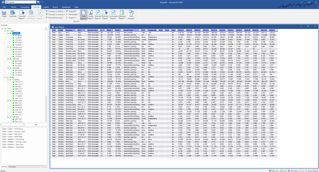
Click on the drop-down for the MAPE column. Select “Sort Largest to Smallest” and press OK.
Suppose we want to now filter out low-volume items. Click on the Mean filter. Select the “Numeric” drop-down and select Numeric. The Numeric Analysis dialog box will appear. In the top drop-down in the Numeric Analysis dialog box select “is greater than or equal to” and enter 10000 in the textbox to the right.
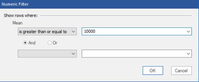
Click OK on the Numeric Analysis dialog box and then click OK on the Mean dialog box. Your screen should now show only items with a mean greater than 10,000, sorted by MAPE.
Click the Graph icon on the far left on the Reports tab to open a Graph view and then click the Auto Arrange icon on the Quick Access Toolbar to tile the windows. Point to the first item on the Item Report and double-click. Point to a different item on the report and double-click. Notice that when you double-click an item on the Item Report, the Navigator jumps directly to that item. Thus, you can use the Item Report as the equivalent of a Hot List to navigate through the listed items. All multi-item report views support this kind of navigation.
