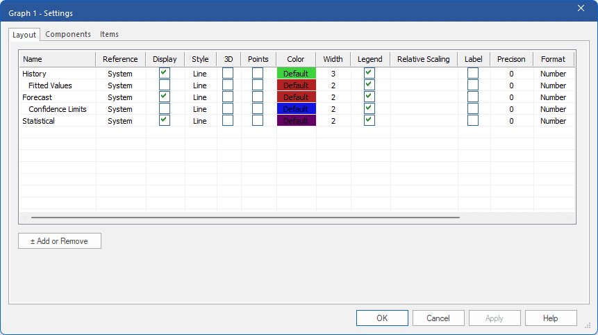
Open the Graph context menu by right clicking on the Graph display. Select Settings and select the Layout tab.
The Layout tab allows you to select the graph style for each row, choose custom line colors and widths, specify if legends and/or labels should be used and link color selections to the Override view.

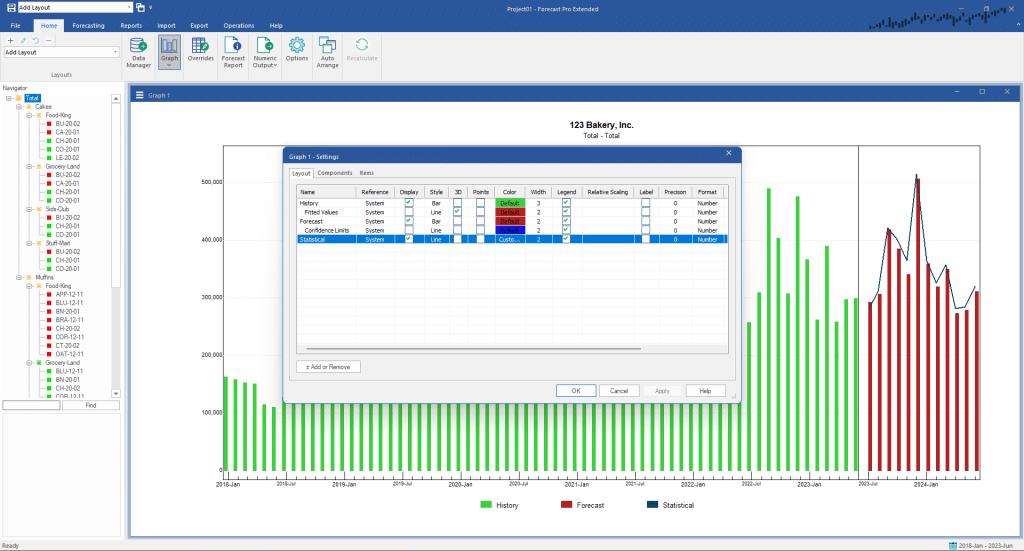
Change the History row’s style to bar by clicking on the current style selection (Line) to invoke the drop-down selection control and then select Bar. Repeat the procedure to change the Forecast row’s Style to bar. Click the Apply button to update the Graph view without leaving the Graph Setting dialog box.
Change the color for Statistical by clicking on the current color selection to invoke the drop-down selection control and choose Custom. A Color dialog box will come up. Select the color of your choice and click OK to close the Color dialog box. Click the Apply button to update the Graph view without leaving the Graph Setting dialog box.

At times it is useful to coordinate the formatting between the Graph and Override views. Scroll the column display to the right using the horizontal slide bar. At the far right is a column labeled Shared. Selecting Shared for a given row will link your selections for color, precision, format, currency symbol, and shared for the Graph and Override views. This allows you to make changes to the shared row options in either view and have them automatically appear in the other view.
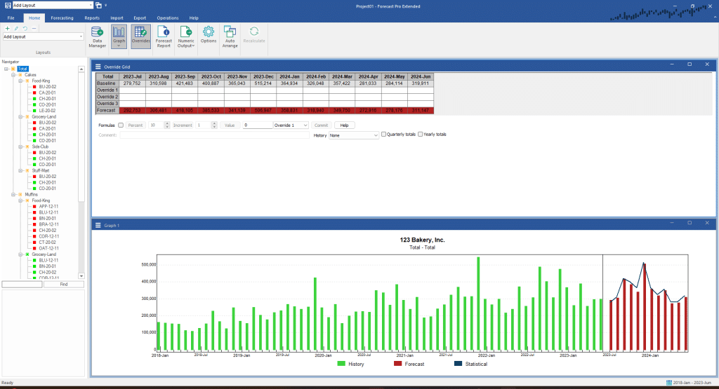
Check the Shared checkbox for the Forecast row and click OK to close the Graph Settings dialog box and update the graph. Click the Overrides icon on the Home tab to open the Override grid. Click on the Auto Arrange icon to tile the two views. Notice that the color you selected for Forecasts is now used in both the Graph and the Override views.

Close the Override grid by closing the window or clicking on the Overrides icon.
Experiment with the graph settings until you are comfortable with their operation.

